Mohr Design has been working on accessibility designs over the last two years, using the user’s experience to guide us. Most organizations are still figuring out the best way to approach accessibility (a11y) design, so we reached out to accessibility expert, Thomas Logan (owner of Equal Entry), for advice on how to create a delightful experience for our users with disabilities. See below for that conversation.
When is it appropriate to deviate from the default top left to bottom right tab order? Priority of communication is taken care of for sighted users in many different ways through the use of typography color and other basic design techniques. But in doing so creates a mismatch between visual design and an a11y considerate experience. Creating a custom tab order can and should compensate, for that of course, but when do golden paths for the accessible user rise to a level where we should break from this typical pattern?
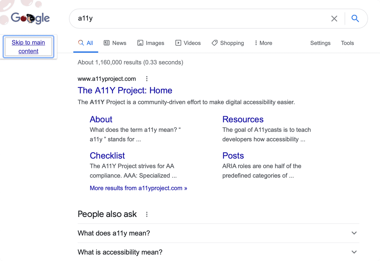
For the logo consider adding a "Skip to content" link. You can avoid having the logo be the first thing someone encounters by adding this link that allows a keyboard user to skip over both the homepage logo and the various repetitive navigation links that exist at the top of the page.
First canonical example for me is the Google homepage. You start in the search field rather than tabbing through Gmail, Images, Menu, and Profile Photo at the top. I think this rule should be broken more frequently when it is a web site or application that a person uses frequently. I agree with the traditional logo example as another logical place where we don't want to go to the immediate default.
If you hire someone from the accessibility consulting world, they're going to teach you the general rules. They're going through so many things. Then somewhere in the translation the general rule just becomes this absolute rule. A lot of organizations then somehow decide it has to be this way. Well technically, that's not even what the standard says. "Do it like this" somehow becomes "don't change it."
The Web Content Accessibility Guidelines Success Criterion 2.4.3 Focus Order allow for "focusable components [to] receive focus in an order that preserves meaning and operability." However, they do not give concrete illustrations of when it is appropriate to do so. I hope as we continue this conversation we can help illustrate thoughtful cases where it is appropriate to deviate from top-to-bottom and left-to-right. Many people end up following the WCAG guidelines with a very rigid thought that it must always be top to bottom left-to-right.
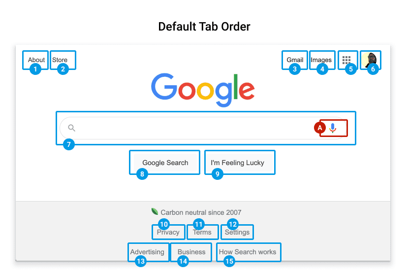
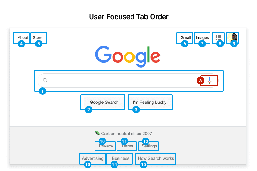
Most examples are developer focused and provide code examples. We need more design guidance.
Why is that? So they can't get sued over things?
Probably because there were arguments in the working group when this was getting written that pushed away from making an absolute rule. It's not like they included an example of when it did make sense to change the order and it still preserved the meaning and operability. They don't show you that as a reference case. So then everyone ends up saying "Okay, just make it this rule of top-down, left-to-right." I think that's why it's good if we include examples and how we thought about the meaning and operability. Either through user testing or through our thoughts we're explaining it, we're trying to show you one or two examples to say, "Here's how you could think about that."
I think your example is a good one. And I think it's an interesting take on that question. It would be helpful to show a small piece of a website and talk about how that particular problem might be addressed and create specific examples. Because that is exactly what is so annoying – there's nothing but talk about all this. Show me. There's no, “Here’s an example of how I did it, and I'm going to explain why I did it this way."
Try hitting tab once the close button is the first element that receives focus on this modal dialog example.
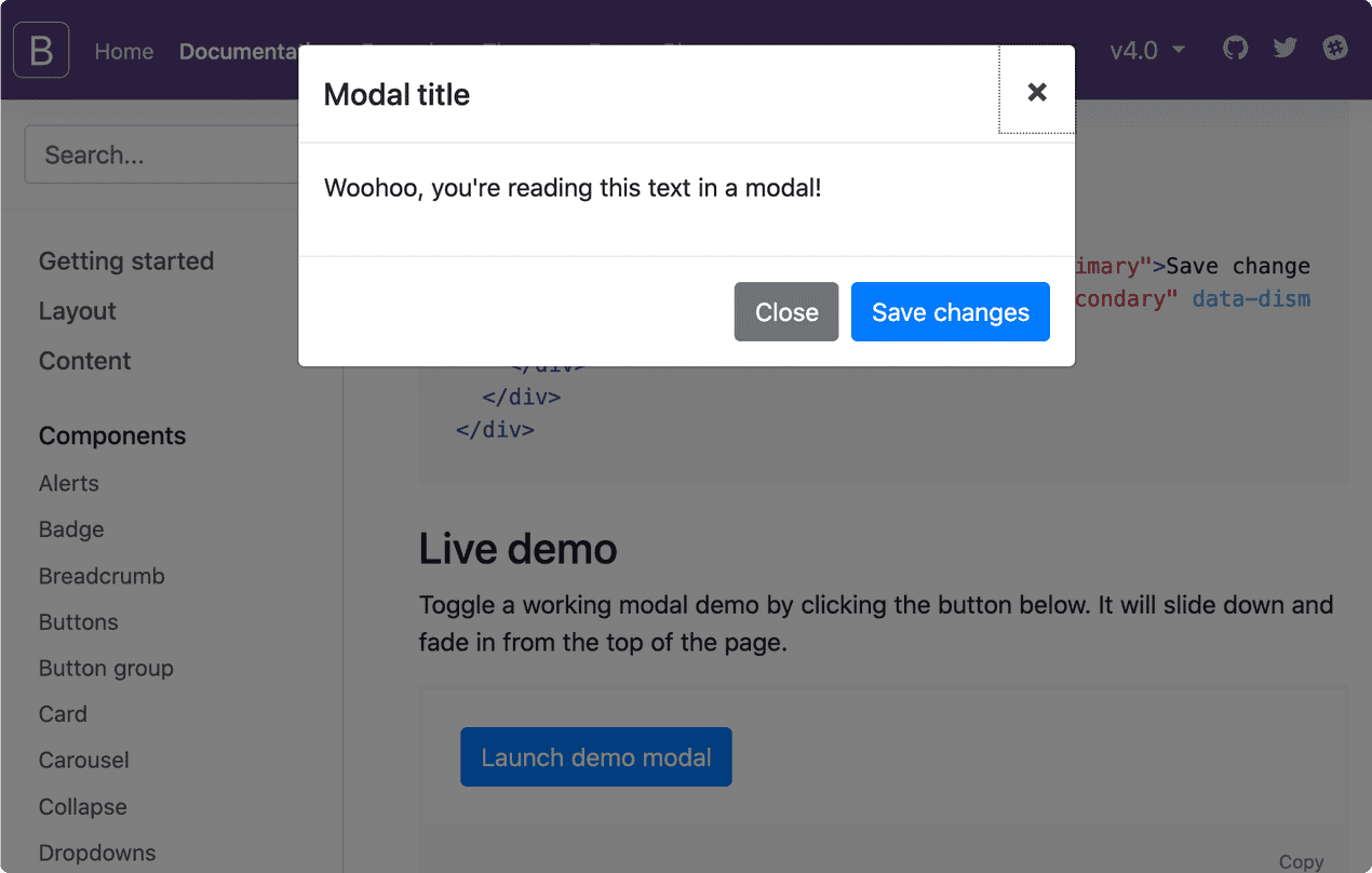
Another example could be a sequenced set of actions in a user interface. An exmple would be when you use Google Maps to search for nearby restaurants. Every time I make a selection the focus order does not move back up to the top of the page. It keeps moving through a logical context on the page.
I think there is always a desire to teach somebody how to obey a rule rather than how to think– you can scale rules. It's harder to scale thinking. If you write rules, then you can automate a bunch of it, or pay someone less money to do it. If you have to hire people to think, it takes a longer and they are expensive.
Right, and then you're worried because if they thought the wrong way and then they did it wrong, then you're legally at risk.


